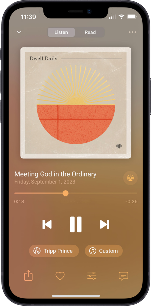
RELEASE: New Streamlined Listening Player
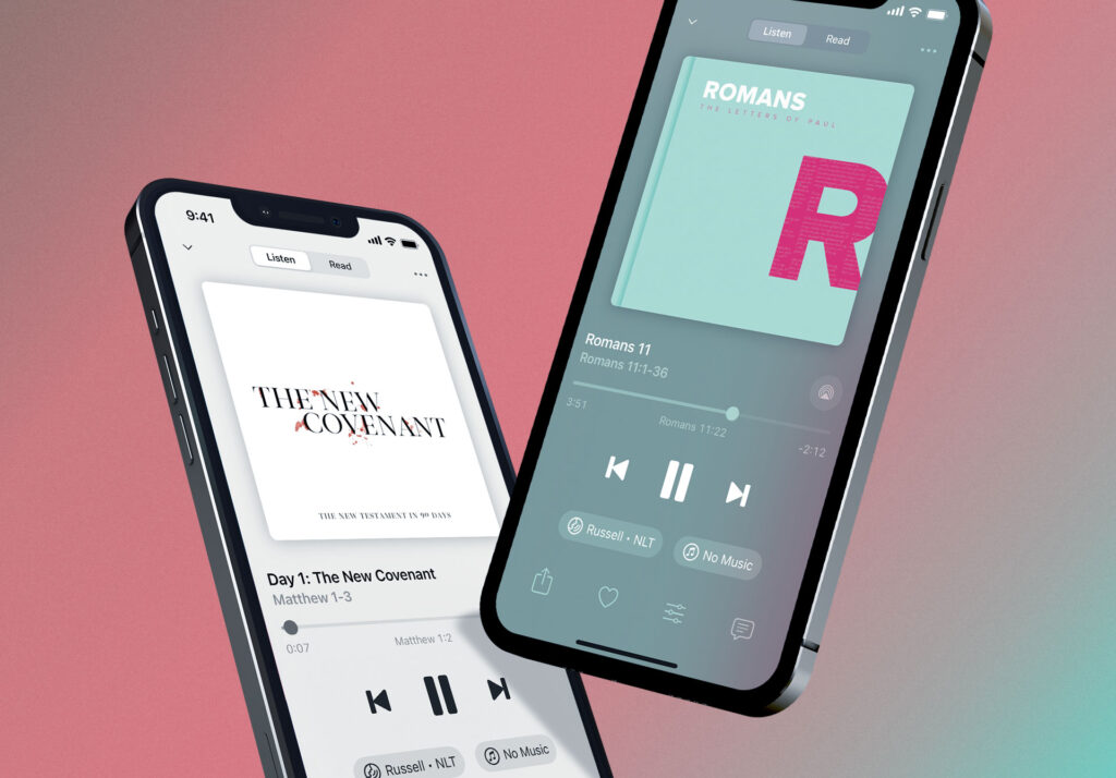
To try out the new listening player, download our newest release in the App Store. For our Android users, the new listening player is coming later this summer. If you happen to have automatic updates disabled on your device, you can come back to this page and tap here to update manually.
The Why Behind the Player Refresh
Just want the Cliffs Notes version of this post? Watch the video below.
For a good part of the spring, we’ve been hard at work redesigning arguably the most important screen in Dwell, the listening player. We began this project with a few goals in mind:
1) A Return to Simplicity – Over the last five years, we’ve added a lot of exciting new features, such as Read Along, Read, Repeat and Reflect, etc. These new features, while making your experience with Dwell more robust and useful, have also caused the player itself to become more clunky. So we really wanted to streamline and simplify the UI where we could, making it easier for you to focus on what matters most.
2) Digital Wellbeing – It’s important that Dwell be a digital space that’s life-giving to you. We want you to feel a sense of calm when you interact with the app, and nowhere is that more important than when you interact with the listening player.
3) One Player for All – The new listening player design not only improves upon our classic Scripture listening experience, it paves the way for new guided biblical experiences, such as devotionals, meditations, and prayers, all coming to the app this fall. In fact, we have a sample of the new daily devotional coming to Dwell below that we’d love for you to hear!
What’s Changed
Streamlined Primary Player Options: Voice & Version and Background Music
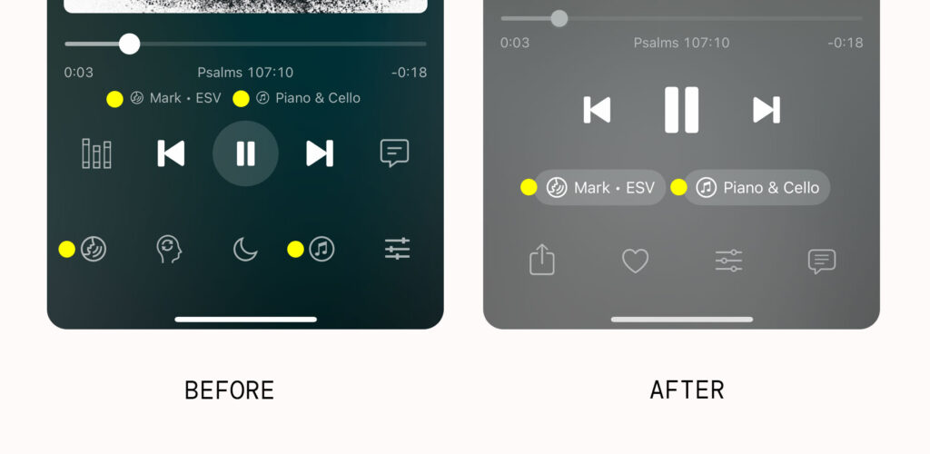
We’ve consolidated the four UI elements that help you view and select your voice, version and background music into two, providing some much-needed breathing space at the bottom of the player.
Things are just more intuitive now. Simply tap the new voice pill to switch voice or version of the Bible that you’re hearing. Likewise, tap the music pill to change the background music.
Built new Options screen to keep Dwell’s growing suite of controls in one place
We’ve consolidated all of the Listening and Read Along controls into a single screen giving you one place to make any and all adjustments as well as view which controls are “on” or “off” at a glance.
This consolidation of the Listening and Read Along options means that the Sleep Timer and Repeat buttons are no longer visible at the bottom of the screen, but they are just one tap away in the new Options area.
Made it a breeze to favorite and share Scripture
We’ve made it a lot easier for you to share and favorite the content you love. We’ve provided quick access to each action at the bottom of the listening player. With the release of Scriptural devotions, meditations, and prayers, this change will be even more beneficial for you.
Repositioned Title and Subtitle for easier viewing
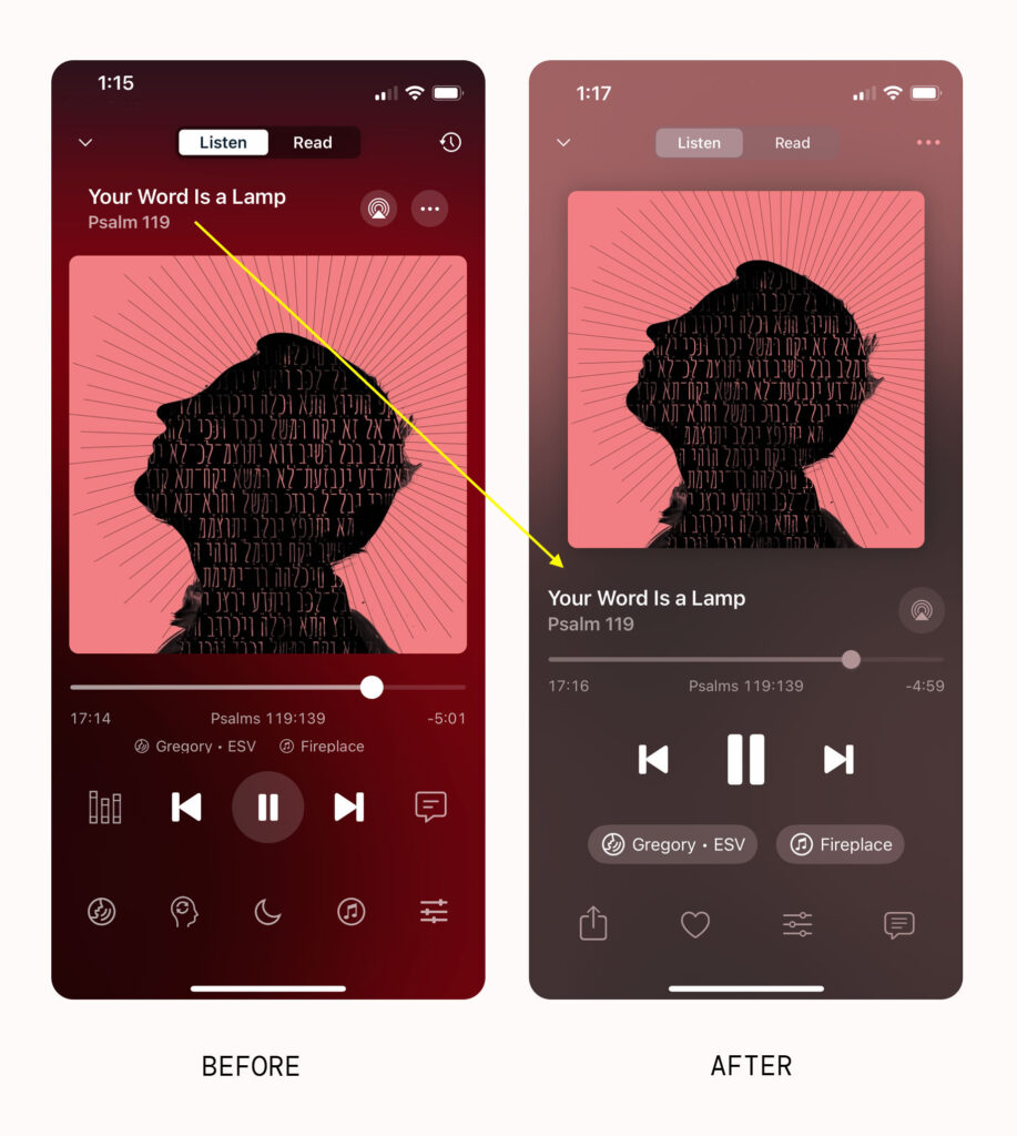
We’ve relocated the title and subtitle near the bottom of the listening player so that your eyes no longer have to scan up and down the screen to view all of the relevant information about what you’re listening to. The comparision above makes it easier to see some of the other, smaller tweaks we’ve made to the player. For example, when Dynamic Background is turned on, the background color of the player is not as strong as it once was. We want this player to be enriching and have a sense of freshness when you come back to it to hear God’s word, but we don’t want it to be visually overpowering so that it becomes a distracting. We feel like we’ve arrived at a good balance.
Made the Scripture reference tappable
Related to that, we’ve made the Scripture reference, which is more often than not the subtitle of any piece of listening content, tappable. It will now pull up the corresponding chapter and book of the Bible, giving you quick navigation to another chapter within the book you’re listening to or access to all of the books of the Bible.
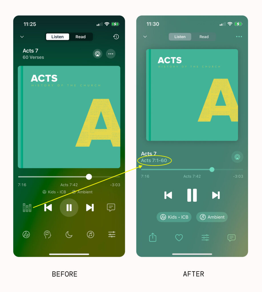
This means that we no longer need the books of the Bible button and is another example of us trying to simplify the screen for you, taking away everything that isn’t necessary, but no more.
Shrunk the artwork to allow the UI elements to better breathe
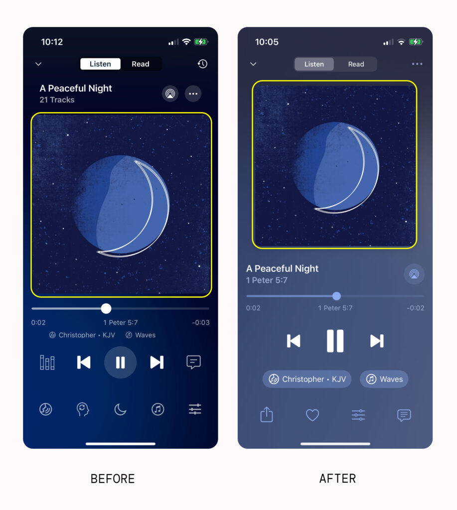
We’ve done a lot of work to remove visual friction to the listening player; one of the ways we’ve done this is by shrinking the artwork to allow for the other UI elements on the screen to breathe better. More margin, more padding, and more empty space makes for a more relaxed viewing experience.
Listen to a sample of the new daily devotional coming to Dwell
The really exciting thing about all of the work we’ve been doing on the new player, is that it helps pave the way for all of the new biblical content (devotionals, meditations, prayers, sleep experiences, etc.) that is coming to Dwell this fall. Listen to a sample of our new daily devotional experience that will be launching at the beginning of September. We hope you find it as life giving as we do.
We hope this post has given you some helpful info on the new listening player. Please reach out with any questions or suggestions! Thanks again for supporting Dwell, and we look forward to continuing to serve you. ❤️
Warmly,
Team Dwell
